
Well, I’m not even going to pretend to be the resident expert. I’ve just gotten started.
But so far, my waves are actually looking pretty decent with acrylics.
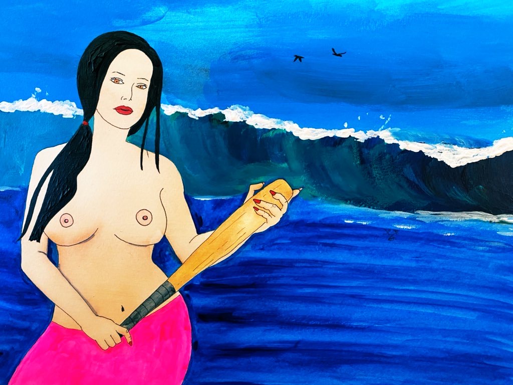
The featured image is Roxy with a baseball bat. Funny story, she was supposed to be a witch with a wand. But she grabbed a baseball bat as a prop instead.
I liked it so much that I kept it as a baseball bat rather than keeping the original idea.
Roxy was wearing a black skirt. You should have seen her. She looked smoking hot!
I mean, she’s always hot but there’s something about a shapely topless woman in a black skirt carrying a baseball bat. (I changed the color in the painting).
The trick is in the movement
Anyways, I’m still painting the girls with watercolors and ink. I haven’t completely switched over to acrylics yet.
I started with watercolors in 2018 because we lived in a tiny ass apartment, a whopping 600 sq ft. We really had no room to do anything and watercolors are the easiest thing to clean up. That’s the only reason I picked watercolors over acrylics.
I got good at painting the girls with watercolors so I’ll keep painting them this way until next year.
Eventually, I’ll be mostly oils. For oils though, I want to take formal lessons. I want to paint like the Masters, including some religious paintings. And of course, my own variation of The Birth of Venus.
With the waves, you want movement.
You’ll need to watch some waves. No, not on YouTube, but real life.
I could tell you the difference between Pacific Ocean waves, Caribbean waves, Gulf of Mexico waves, and Black Sea waves. I’ve been to other seas as well (like the Mediterranean, Lake Michigan, and the Atlantic) but those four are the ones I’m most familiar with.
Pacific waves are the best for painting. Caribbean waves have the best color. Black Sea waves are the most unique. I’ve heard Lake Superior are the most dangerous but I’ve never been there.
You want your brush strokes to show movement, so the viewer can get a sense that the waves are real.
Then you put the white caps on heavily with acrylics. Real heavy. And add splashes.
For the final touch, you’ll see there’s some water over the white in some part. This is key. You need to your brush strokes to mimic that water as it’s splashing down and creating even bulkier white caps than the rest of the waves.
Then I put some white under that part because that water’s really going.

Once again, watch some waves in real life. They’re never even and they don’t really follow the same pattern.
They’re chaos and you need to mimic that.
Colors
The colors are totally counterintuitive. I’m using white, black, green, and blue.
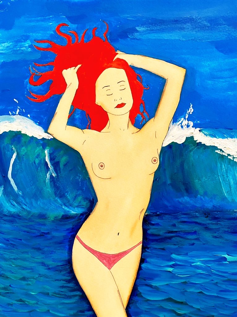
The painting of Katie was from one of my first attempts. Since then, I’ve changed the way I paint my water with acrylics.
That’s the thing. You should always be evolving. Try out different techniques and go with what you prefer.
Anyways, back to work. I’m currently painting Roxy with a jacket on and nothing underneath.
Roman I am fascinated by your work.
I had no idea that Cabanel’s Birth of Venus was done in oil, as I always thought it was tempra (water color + egg whites) so thank you for teaching me.
I look forward to seeing more of your writings and works, and hope to see you try your hand at the Birth of Venus – Roman style someday soon.
Thank you Laz!
I think I’m still years away from Birth of Venus though. When I make the switch to oils, I’m getting formally educated.
So far my only formal education is one-on-one anatomy lessons with graphite.
And yes, absolutely love Cabanel’s version of the painting. One of my absolute favorites ever.