
I hope y’all have at least one watercolor journal. This is the most affordable way to do this.
We’ll be doing a simple experiment. We want to test color matching. We simply pair two colors. And see if they work.
For this experiment, it’s a simple exercise in dualchromaticism. If you don’t know what that is, it’s monochromaticism except with two colors instead of just one.
I’m drawing a simple octopus. His name is Charley. Say hi to Charley.
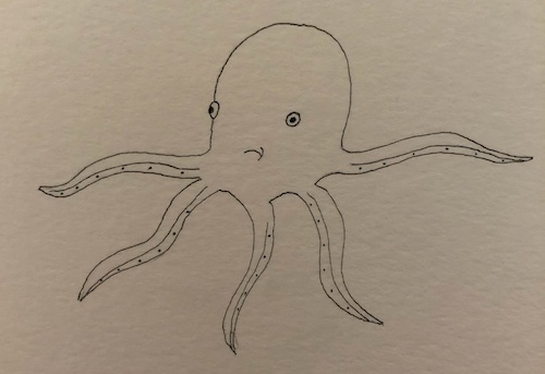
If you want, you can do a simple flower, or even print out Charley. Click here for the PDF.
Dominant color and the accent color
There are many ways you can do this. If we wanted to do the example with Charley, it will be a dominant color and an accent color. The dominant color will be most of Charley. The accent color needs to pop a little.
So you can hypothetically try using a cool color for the dominant color and a warm color for the accent color. I go over warm colors vs cool colors in my color theory article.
Colors that blend
Or the second way to look at it are colors that blend together. Neither pops. They just blend. Like for instance, you can take a purple and a deep blue and see how well they blend. Which purple? Which blue? Depends what you have available.
No guarantee they’ll blend as if you’ve been doing watercolor for awhile, you’ve probably accumulated quite a few blues over the years.
Or just pick two colors without thinking
Sure, sometimes artists overthink things. Sometimes, you should just do things on a whim, without thinking about dominant colors, accent colors, warm colors, cool colors, or any of that jive.
Just paint.
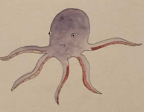
That’s what I’m going to do with my Charley. I’m picking two Daniel Smith colors – Iridescent Ruby and Moonglow.
Now, Moonglow, I absolutely love. It’s one of my favorite colors because I can get it to work in so many different ways. However, of the dozen DS colors I own, Iridescent Ruby is my least favorite. It’s the only DS color I don’t like. I have three from the DS Luminescent collection and love the other two, hate this one.
That’s why I chose these two. One color I love. The other one I hate.
Do they work?
You decide.
Pick two colors you want to test
Now pick two colors you want to test. Either you feel they work or they don’t.
Note that there are no right answers. Once again, either you feel they work or they don’t.
This is subjective. You may love it. I may hate it. And vice versa.
All that matters is that it’s pleasing to your eyes. Or if you want to sell it, pleasing to someone who’s walking around with a credit card and looking to buy an art piece or two.
So if it’s purely for you, if it passes your own eye test, you’re successful. If you’re planning on selling it, you may want to study a little color theory.
Note that I even take this all with a grain of salt. No two humans are alike and no two humans have the same taste. The painting Interchange sold for $300 million recently and I wouldn’t pay $100 for it, (unless of course I knew it would resell for millions).
So back on topic, I believe the best test of all is the eye test. Either you like it or you don’t.
Pick two colors. And try them out.