
My son picked up my insane work ethic. He hates wasting time more than anything else.
Next time I talk to him, I’ll talk about measurable improvements.
You see, people like us get frustrated when we feel like we’re spinning our wheels. I like getting shit done and I like to see visual improvements in what I’ve accomplished.
That’s why I used to play videogames. Too much.
Videogames are addictive to people like us. You definitely see improvements. Like one day, Bald Bull is kicking your ass and a week later, he’s easy.
That’s why I had to give them up entirely. I was simply spending too much time on them.
Now, I use all that time on two things – painting and piano. This morning, I woke up and practiced the Lullaby I’m dedicating to Roxy. I’m not ready to record it yet, but I’m definitely putting the hours in. It will be available on this site sometime this year.
Which leads me to watercolors
I am a Fantasy Pinup artist. Watercolors are my main medium. I also use ink and gouache.
I love the look of ink. A lot of artists will start with pencil, then erase it so there are no visible lines. It’s personal preference. I prefer the look of ink, so I’ll pencil in something, then ink it, then erase the pencil.
For my primary subjects, I paint beautiful women. Allie, Roxy, and Sophia are my current models. We may add a fourth this year. I’m actually discussing the possibility of modeling for me with a lovely young lady.
I’ve seen her topless and she’s got a beautiful body. She’s also a genuinely nice person. Funny too. I like people with senses of humor.
Process improvements
But I don’t only want to be known for my ability to paint beautiful women. I want to be seen as a complete artist. Someone who mastered everything, including colors.
I’m heavily into colors. I go thru periods where I prefer certain colors. I think most artists do this. We fall in and out of love with certain colors. Luckily, there is no limit to the amount of colors out there.
Sure, there are a limited amount of primary colors and everything else is a variation and/or combination of those colors. But you know what I mean. We refer to orange as orange, not as red yellow.
And what better way to show off colors?
Flowers. Especially with watercolors.
Sure, acrylics and oils can do awesome flowers. That’s not what I’m saying.
But I will say that I’ve found a really cool technique with watercolors.
First, the drawing
I base my flowers off of real life flowers. My wife and I both take pictures of flowers all the time. Plus, we have flowers in the house.
We own some of the flowers you see in my paintings.
Others, we’ve shot around the world. My wife and I took a lot of pictures in a botanical garden in Panama for instance. An older hippie couple runs it and they do fine work.
The last time we went to Vegas, we took tons of pictures of pretty much everything. A lot of people don’t think of flowers when they think of Vegas, but if you walk around with a camera and look for beautiful flowers, Vegas is one of the best cities on the planet for that.
Yes, seriously.
So none of the flowers you see are imaginary. They’re all based off of real flowers.
If you want to draw flowers from your imagination, more power to you. In my opinion, the only thing that matters is that they look good.
I say based off of real flowers because I draw the flowers. Then, I make them dance.
Dance is an underrated subject for artists. More on that another day though.
I feel like if I really want to bring the flowers to life, make them dance.
Next, the colors
This is where I have the most fun. The other reason I say “based off of real flowers” is I almost never keep the natural colors.
The flowers are the absolute last thing I complete when I paint. I paint the model first. Then the background. Then, I color in the flowers.
So when I start the painting, I literally have no idea whatsoever what colors the flowers will be.
Which is great. You get to step back, look at the painting as a whole, and figure out what colors the painting needs.
Ideally, you want the flowers to fit in with the painting. Not stand out too much. But not be too subdued.
For me, the models are the main subject, not the flowers.
If your flowers are the main subject, then disregard what I just said. Then, you want the flowers to stand out boldly.
The process
Disclaimer – there are many, many ways to do it. I’m just explaining how I do it.
If you paint flowers a completely different way and they look beautiful, pat yourself on the back. Seriously. That’s awesome!
Very few things are more annoying than an artist who thinks his way is the only way to do it. I can assure you, there are a thousand ways to paint a flower that look good.
I like simple, repeatable processes that allow me to hone my technique. That’s also what I’ll be teaching once I get my online courses going. You will learn simple, repeatable processes and what will make you stand out is the way you hone your technique, which will be different from the way I do it. And that’s a good thing. You want to be unique. You want to be you, not a carbon copy of someone else.
Anyways, I take two, and only two colors, then paint. You take a good look at the background. You take a good look at the flower. Then you decide which two colors will look the best for that given situation.
This is very much different from dualchromaticism. My dualchromaticism technique is two colors for most of the painting. We’re using two colors for a single flower.
When others initially see it, they’re surprised when I tell them that it’s only 2 colors. It looks like it’s many, many more.
That’s yet another strength of watercolors. The amount of water changes the colors. So does blending and overlapping. So do the amount of layers you apply, although less so than the amount of water and blending and overlapping.
The flowers
I’m going to hire a professional photography lady to take pictures of my paintings. We’ll be using them both for future prints and also, I’ll be creating my first coffee table book, which will be available for purchase here on this site when it’s ready.
I’m unfortunately a mediocre photographer. These pictures don’t do the colors justice. Especially the Daniel Smith luminescent colors.
These colors are spectacular. For the luminescent ones, Daniel Smith puts iron oxide in the paints so they look magical.
Anyways, here are the 3 examples:
I’ll tell you which colors I used for each flower. However, the colors are secondary to process.
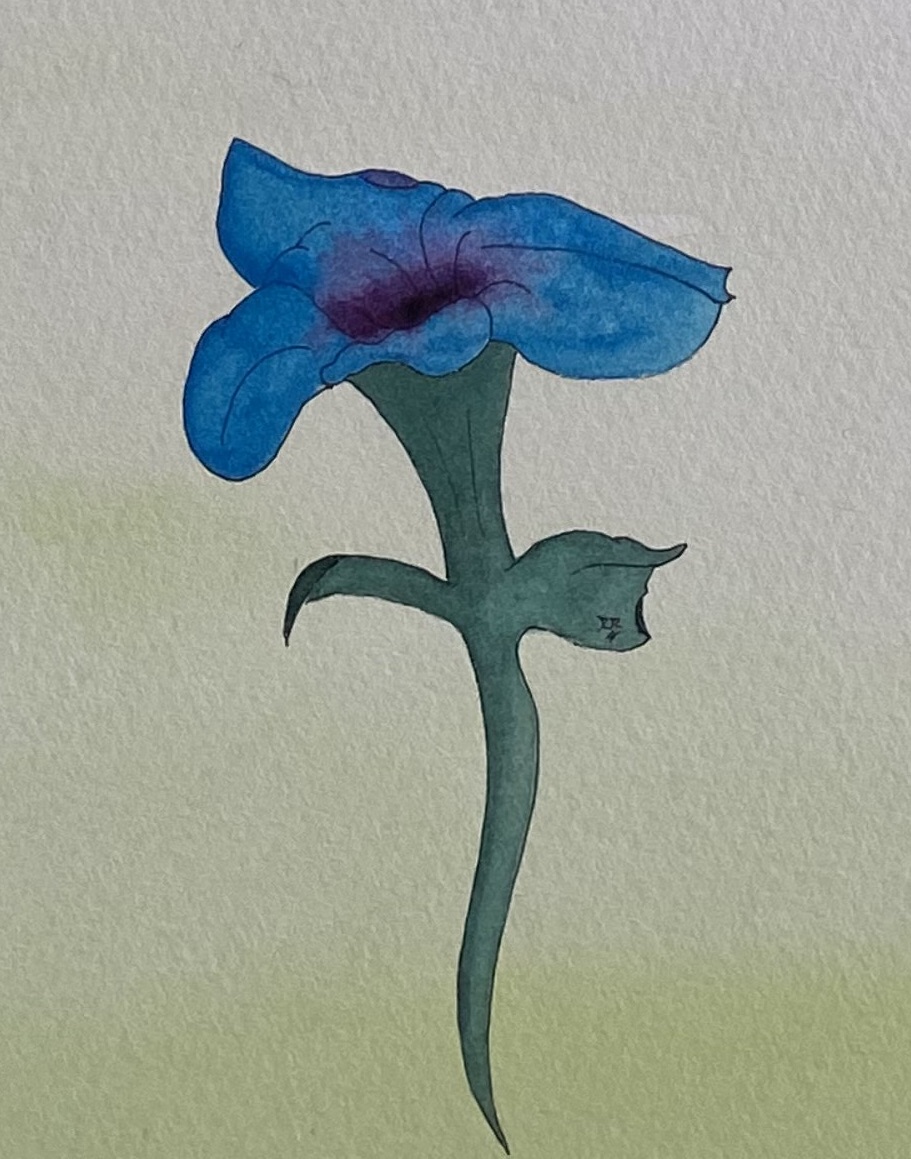
For the first flower, I used Daniel Smith’s Iridescent Electric Blue and Daniel Smith’s Rose of Ultramarine. I painted lightly for the iridescent blue. However for the rose, I put it on really thick.
Note how it looks like you can drop a coin in there. That’s the desired goal. I wanted to create depth. Whereas the painting itself is a flat surface (two dimensional), I wanted to make it look three dimensional.
So you will be looking at colors in different ways. Note just color, warmth vs coldness. But you also have to consider how various colors can create depth. Of course, this is assuming you’re good at drawing flowers too.
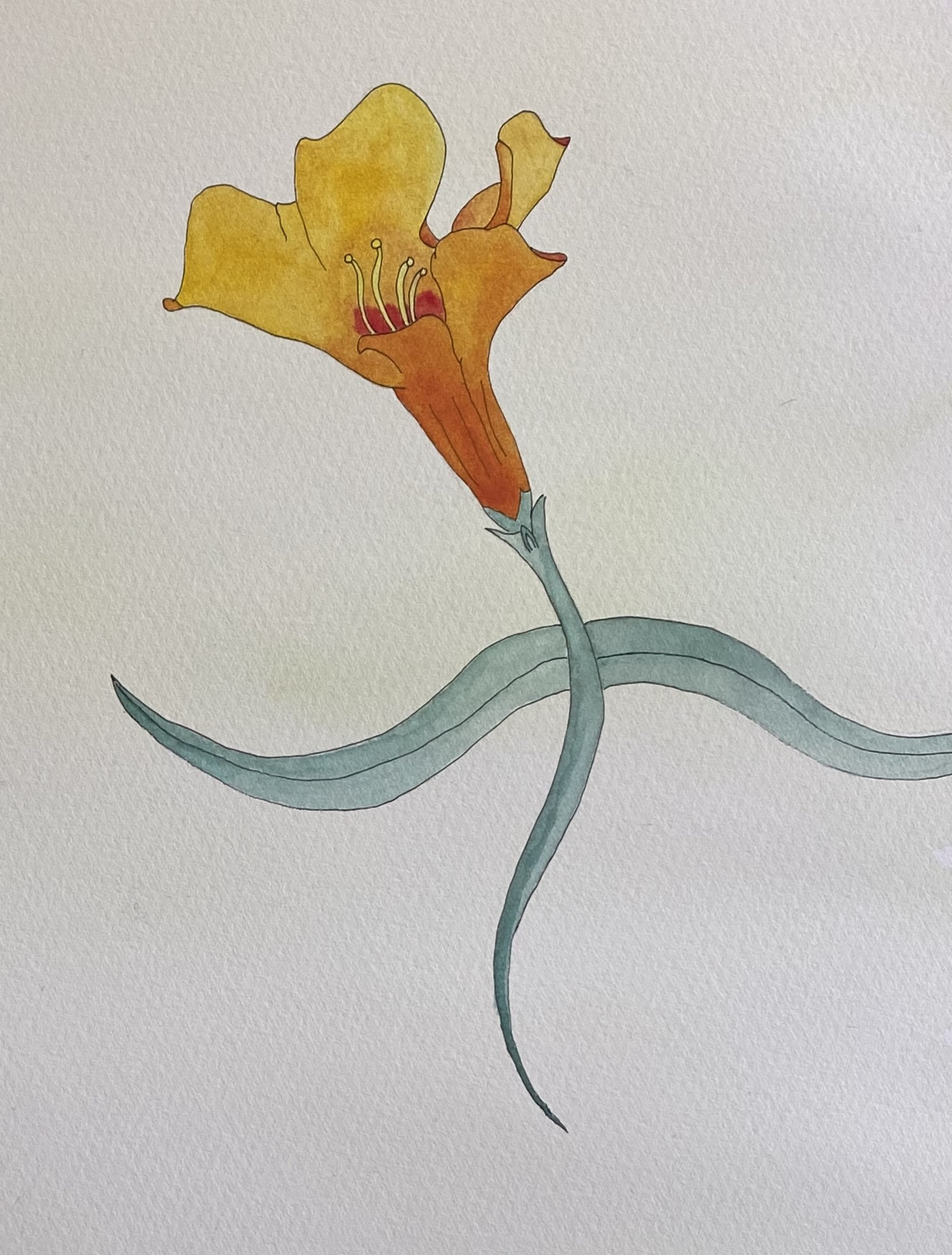
For the second flower, I used Sennelier’s Yellow Light and Sennelier’s Red. I painted a whole layer of yellow over the flower initially. Then I started adding highly watered down layers of red to get the whole flower various shades of orange. It’s just a mix of yellow, red, and various amounts of water.
Note for the flower’s antlers and filaments, I kept them yellow. And for that part of the flower were you can drop a coin in it, I used a lot of red.
I also used a little bit red-heavy orange for the outside folds, to give the pedals additional depth.
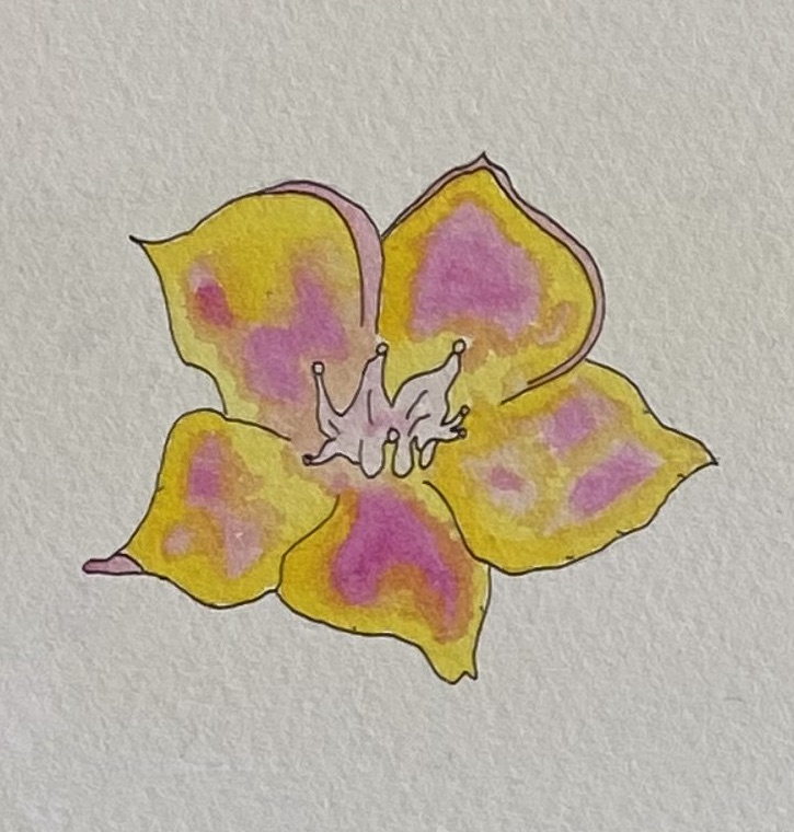
For the third flower, I used Sennelier’s Yellow Light and Sennelier’s Opera Rose. For the most inner parts of the flower, I used really watered down rose to give it a more pinkish color. The rest of the flower, I varied between different percentages of each so it looks like it’s at least half a dozen colors. In reality, it’s only two.
For the stem and leaves, I used only Sennelier’s Forest Green. The third flower doesn’t even have a stem and leaves. It’s just a flower.
Make them look alive
Now, you don’t have to exaggerate their lives like I do. I’m making them dance.
I do Fantasy Pinups, and note the word “fantasy.” Flowers don’t get up and dance in the real world. (Well they do when you’re on PCP).
But consider using colors to make them look as alive as possible.
Also, definitely do not make them muddy. You do that by getting carried away and doing too much. But if you’ve been watercolor painting for awhile, I’m pretty sure you’ve ruined at least one painting by muddying it.
And let me know if you have any questions. I’ll eventually make a video on this.
It all comes down to technique. The colors are secondary.
Find colors you really like working with and master those colors. That’s why I have exercises like doing monochromatic and dualchromatic exercises. They force you to work with only one or two colors.
Later on this week, I’m going to teach a class on this. I’ll take some of my old student grade watercolor paper I have sitting around collecting dust, draw some flowers, ink them, and allow my students to pick two, and only two, paints.
Sometimes less is more. Study old Japanese art and you’ll see exactly what I mean. I love Hokusai’s art, and a lot of the other artists of the Edo period. You’ll see some of them work with only a few colors, yet their paintings/woodcuts had so much expression.
Study art history
Which leads to something very important about art.
I come from more the musical background. I myself am a failed musician.
When I got onto the scene, Metal was on its way out. It was hard for us to land gigs in decent places and we pretty much starved. That’s why I took jobs waiting tables because they threw out the food every night which allowed me to have cash and actually eat.
But, I learned a lot and I’m unarguably a damn good musician. I can even read notes and I compose for orchestral instruments from either my guitar or piano.
If you’re a musician, you learn covers. I can play covers from everyone from Prince, Ozzy Osbourne, Megadeth, Journey, etc. All over the place. Since 2012 though, I’ve been studying more Classical music as I got seriously into orchestration.
The same goes for painting. You should be able to name your top 10 favorite artists and explain why you like each one. You should also be able to tell people which techniques you stole from each of your favorite artists.
I switched from music to painting when people actually approached me and spent serious money on my artwork. I’ve had single paintings sell for more money than all the years I’ve ever spent on music combined.
What does this have to do with watercolor flowers?
Everything.
If you actually want to sell your work, you need to do your homework. Potential buyers will ask who your influences are. Conversation sells. If you can’t keep up a decent conversation, you’re going to sell less works.
So yes, Disney has dancing flowers. Did I steal from Disney? Probably. I probably picked it up subconsciously because I’ve seen Fantasia twice.
Or maybe it was simply drinking too much absinthe. Who knows?
You’re going to get asked stuff like this and you’ll need a response. My response? You just heard it.
Also, paint a lot. Paint every chance you get.
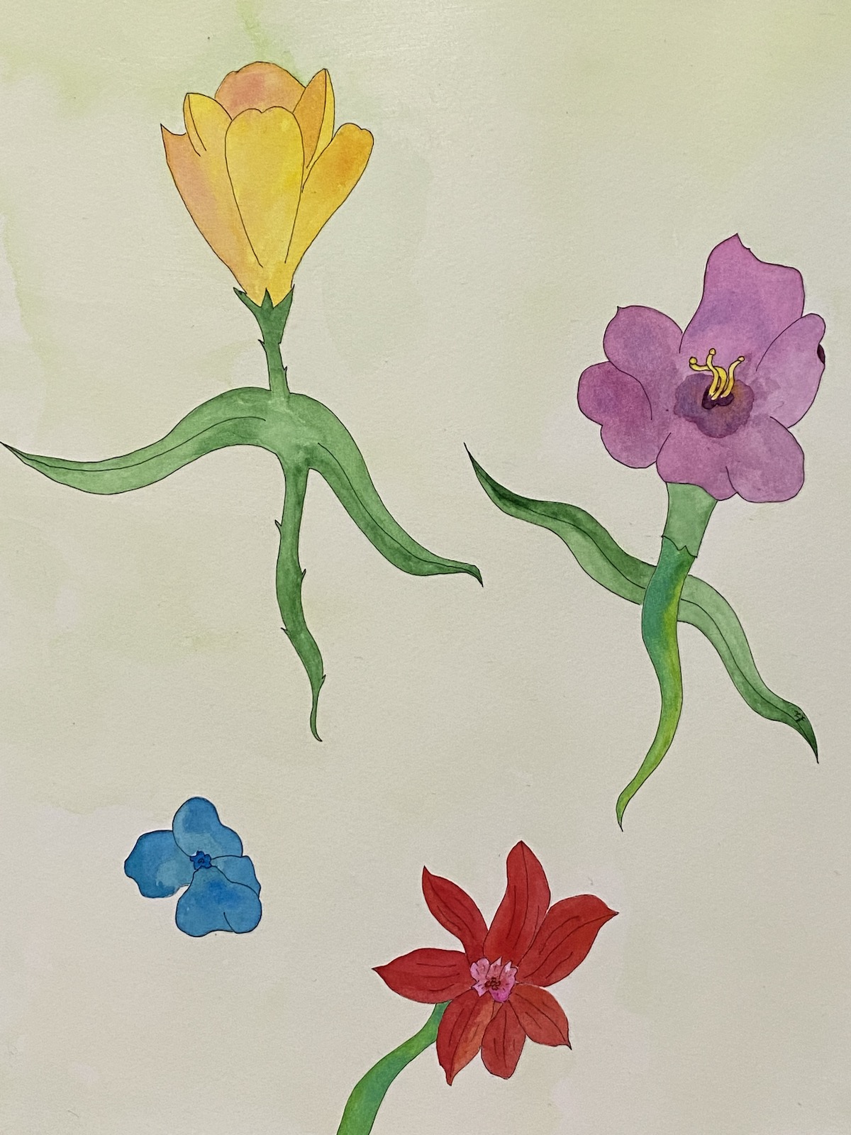
I had some downtime the other night since I already painted the latest pose from Roxy and just did a random flower painting. It was fun so I’ll probably do a lot of these.
These flowers aren’t as good as the ones up there. But it happens. Some days will be better than others and some paintings will be better than others.
But the more you do, the more you hone your skill sets.
The best artists are the ones who love art. They love everything about it. They love studying it. They love doing it. They could talk endlessly about tools, process, and anything else related to art.
In their free time, they’re doing art. They do art every chance they get. What do they do for work? Art. What do they do for fun? Art.
Then people will be like “you’re so lucky you’re talented.” Insert eye roll emoji here.
So take what you like from this post and discard what you don’t. Like Bruce Lee. He took a little from here and a little from there. He took what works and discarded what he felt won’t work or he simply didn’t like.
Apply that to your art.