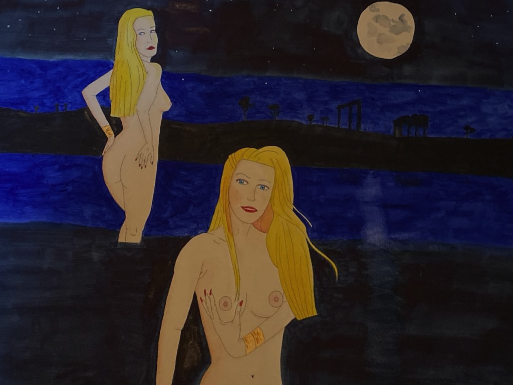
I’m sharing with you one of my watercolor secrets. If you want to get that magical nighttime look, I simply use these three colors – French Ultramarine, Indigo, and Payne’s Grey.
But since I’m painting on a watercolor board this time around, I’m going to go through a lot of paint. You need to really layer it on there.
I like alternating the surfaces. Sure I usually paint on watercolor paper, sometimes even on wood. But recently, I’ve been painting on a lot of watercolor boards.
Anyways, about those colors. Let’s examine each one.
French Ultramarine
I’m not a brand stickler. Some stores around here are heavy into Daniel Smith. The closest one to me prefers Windsor and Newton. Whatever. I think good paints are good paints. Both brands have wonderful versions of each of the three colors. And they’re not the only brands, just the most accessible where I live.
French Ultramarine is a deep blue when not watered down. You can water it down to make it a weaker blue. In this case, it’s on there pretty thick. Very little water. You can see how deep it is.
If you’re wondering, French Ultramarine is made by grinding up lapis lazuli, a beautiful blue rock, into powder. During the Middle Ages, it was the most expensive pigment, even more expensive than gold.
For our purposes, it’s the deep blue layer, the lightest of the three but still plenty dark. To get that white moon reflection, I simply take a piece of paper towel, wet it, and wipe away a little bit of the paint.
Indigo
Have you ever played that board game Puerto Rico? If you have, you know indigo is one of the things you trade. You may also know indigo as the dye for your blue jeans.
Indigo comes from plants. Nowadays, a lot of it is synthetic but back in the day, it came from plants.
For colors, it’s almost halfway between purple and blue. It’s another rich blue color.
Once again, I caked it on there as I really like the color. It can get quite dark when caked on. That’s about four layers of paint on there.

Payne’s Grey
What’s Payne’s Grey? It’s a super dark blue/grey color that artists often use when they don’t want to use black.
William Payne was an English watercolorist. He invented Payne’s Grey and his works were already forgotten in his lifetime. Unfortunately for him, he’s best known for inventing that color, rather than his works.
For my purposes, it’s a dark color that’s not quite black. I love black, don’t get me wrong. But I only use true black for black purposes. In my opinion, Payne’s Grey goes better with Indigo and French Ultramarine than black does.
The girls
Both girls are Allie. I wrote up the backstory of the painting and will post it once I get this thing framed. This is Aphrodite and a human friend, visiting Greece in 2019. No, no place like this exists exactly as in the painting. I simply took a bunch of pictures that we took from Greece a few years back and combined them on a magical island. Yes, those trees as well are from Greece.
I wrote up a whole article on how I get my skin tones in watercolor. So you’re really not seeing too many colors here. You’re seeing the colors for Allie and those three colors mentioned above. That’s it.
I rarely go crazy with colors in watercolor. Usually, I keep to seven colors a painting.
The stars? Gouache.
And one more thing. Let’s talk about color theory. You’ll notice the girls “pop out” a bit. Ultramarine blue, indigo, and Payne’s grey are all cool colors. The girls are mainly warm colors. So by theory, they should pop out.
Do they? I think so.
